Shark Attack Analysis
Project Information
- Category: Data Analytics / Public Safety / Environmental Science
- Client/Context:Quantum Analytics/Public Awareness & Research
- Project Date: Nov 2023
- Tools Used: Power BI (Power Query, DAX)
- Data Source:Global Shark Attack File (past 100 years data) provided by Quantum Analytics
- Project URL: View Live Dashboard (If available)
Diving Deep into Shark Attacks: My Power BI Journey into Over a Century of Data
Summary: My Mission to Unmask Shark Attack Patterns from Raw Data
As a Data analyst, I'm thrilled to present my "Shark Attack Analysis" Power BI project. This endeavor wasn't just about building a dashboard; it was a mission to conquer over a century of raw, messy shark attack data and transform it into clear, actionable insights. I spent a significant amount of time in Power Query, battling inconsistent text, standardizing messy entries, Performing text analysis using M code to capture crucial details like body parts injured and building robust conditional columns to categorize and standardize time of attack, and shark species involved. The result? A powerful tool that reveals reliable trends in attack frequency, geographical hotspots, common injuries, peak times of day, and the most frequently encountered shark species. My goal with this project is to enhance public awareness and contribute to smarter safety guidelines for marine recreational activities.
My Key Discoveries and Why They Matter:
1. The Big Picture: Shark Encounters Over Time
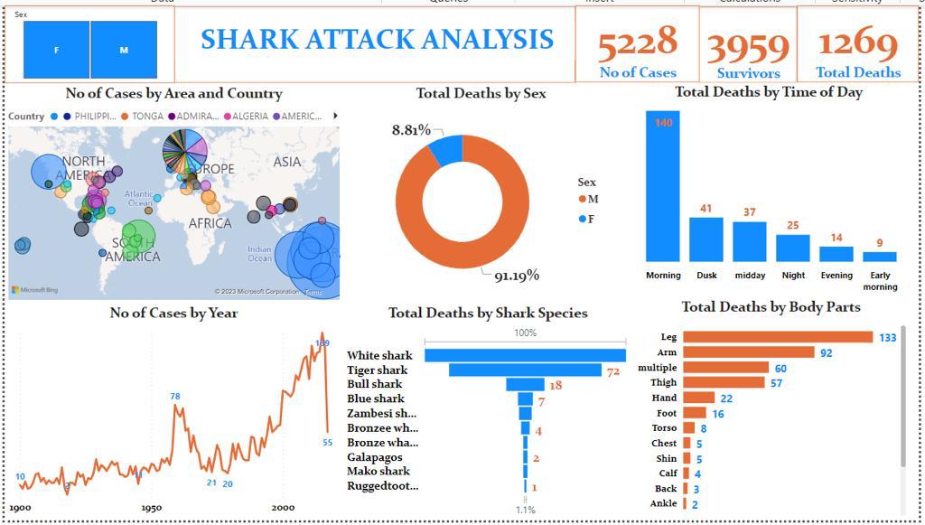
- Total Cases: My analysis processed a massive 5,228 shark attack cases from the past 100 years.
- Survivors vs. Fatalities: I found that 3,959 individuals survived, while sadly, 1,269 attacks were fatal.
- A Rising Trend: The data clearly shows an increasing trend in reported shark attacks since the early 1900s, with a noticeable acceleration after 1950 and a peak around 2000. While this might seem alarming, it likely reflects factors like increased human activity in coastal waters, more effective reporting, and better data collection over the decades.
2. Where and When Attacks Happen (And Who's Most Affected):
- Global Hotspots: My map visualization powerfully highlights attack clusters in coastal regions of North America, Australia, Africa, and parts of Asia. This immediately tells us where to focus safety efforts.
- Morning Risks: A critical insight I uncovered is that "Morning" hours account for the highest number of deaths (180), followed by "Dusk" (41) and "Midday" (37). This suggests that specific times of day might be riskier, potentially coinciding with both human presence and shark activity patterns. This is a direct actionable insight for beachgoers.
- Male Disparity: My analysis reveals a stark gender disparity: 91.19% of total deaths were male, compared to just 8.81% female. This strongly suggests that males are more frequently engaged in activities that lead to shark encounters.
3. The "Usual Suspects" and Common Injuries:
- Key Species: The "White shark" is identified as responsible for the most fatalities (72), followed by the "Tiger shark" (18) and "Bull shark" (7). Knowing these dominant species is vital for species-specific research and awareness.
- Common Injuries: My detailed analysis of injuries, which was one of the most challenging data cleaning tasks, shows that the "Leg" (133 deaths) is by far the most commonly injured body part, followed by the "Arm" (92) and "Multiple" injuries (60). This aligns with the typical "test bite" or defensive strike nature of many shark encounters.
My Technical Approach: Taming the Data Beast with Power BI
This project truly stretched my data engineering muscles, particularly in Power Query. Here's how I tackled it:
- Data Ingestion: I started by pulling in the vast historical shark attack dataset into Power BI Desktop.
- Power Query - The Real Hero: This is where the magic (and hard work) happened. The raw data was incredibly messy.
- Complex Text Analysis for Injuries: This was a beast! The 'Injury' column was free-form text. I wrote extensive, direct M code, using functions like `Table.ReplaceValue` and `Text.Contains`, to systematically extract and standardize mentions of body parts into clean categories like "Leg," "Arm," "Multiple," etc. It was a painstaking but rewarding process to make sense of that chaos.
- Standardizing Time: The 'Time' column was a mess of different formats. I created a conditional column to categorize attack times into logical periods like "Morning," "Midday," "Dusk," etc., making temporal analysis possible.
- Categorizing Shark Species: The 'Species' column was equally challenging with its variations and typos. I developed a conditional column using `Text.Contains` to accurately group and standardize species into identifiable categories (e.g., "White shark," "Tiger shark"). This was crucial for understanding which species are most involved.
- Defining Fatality Status: I built another conditional column to clearly categorize incidents as "Fatal" or "Non-Fatal," ensuring accurate calculations for survivors and deaths.
- Beyond these, I ensured data type standardization, handled missing values, and cleaned categorical fields like 'Country' and 'Sex'.
- DAX for Deeper Metrics: I leveraged DAX to create robust measures, calculating totals for cases, survivors, deaths, and percentages, all built upon my meticulously cleaned data.
- Visualizing the Story: Finally, I designed the dashboard with clear KPI cards, dynamic line charts for trends, an interactive map for geographical insights, and compelling bar and donut charts to present the victim and shark characteristics. The slicers for Gender and Country provide full user control for deeper dives.
The Impact: Driving Smarter Safety and Understanding
This Power BI dashboard isn't just a collection of charts; it's a vital tool for:
- Boosting Public Safety: By highlighting high-risk times and locations, we can issue more targeted warnings and promote safer recreational practices. Knowing that "Morning" is a high-fatality time, for example, can directly influence advice to beachgoers.
- Informing Conservation Efforts: Understanding which shark species are most involved helps inform conservation strategies without unfairly demonizing these magnificent creatures.
- Supporting Policy Makers: This data provides evidence-based insights for local authorities to implement smarter beach regulations and resource allocation for emergency services and marine monitoring.
- Scientific Research Aid: Researchers can leverage the aggregated and cleaned data to further investigate environmental factors, human behavior, and shark ecology related to encounters.
- Changing Perceptions: By presenting factual data, I hope to replace sensationalism with a more balanced and informed public understanding of shark encounters.
- Showcasing My Skills: Successfully tackling such a complex and messy dataset demonstrates my advanced data cleaning capabilities in Power Query, which is a critical skill for any data professional.
Conclusion: My Contribution to a Safer, More Informed World
I'm incredibly proud of this Power BI project. It exemplifies my ability to not only analyze data but also to painstakingly clean and transform it from its rawest form into clear, actionable intelligence. The "Shark Attack Analysis" dashboard offers invaluable insights into historical trends, geographical hotspots, and crucial risk factors, serving as a powerful resource for public safety, marine research, and fostering a more nuanced public perception of shark encounters. This project truly showcases my passion for using data to solve real-world problems and contribute to a safer, more informed society.